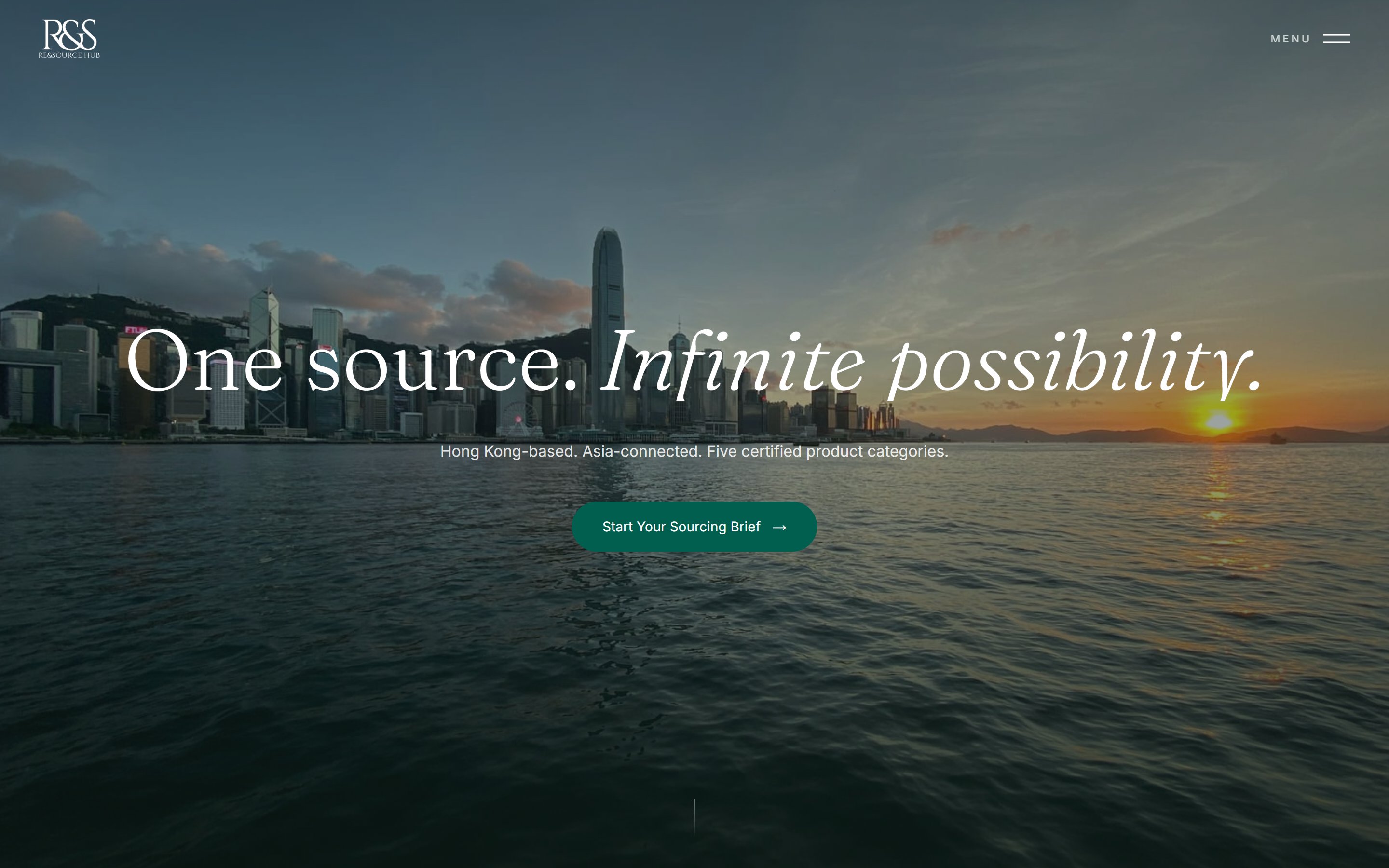
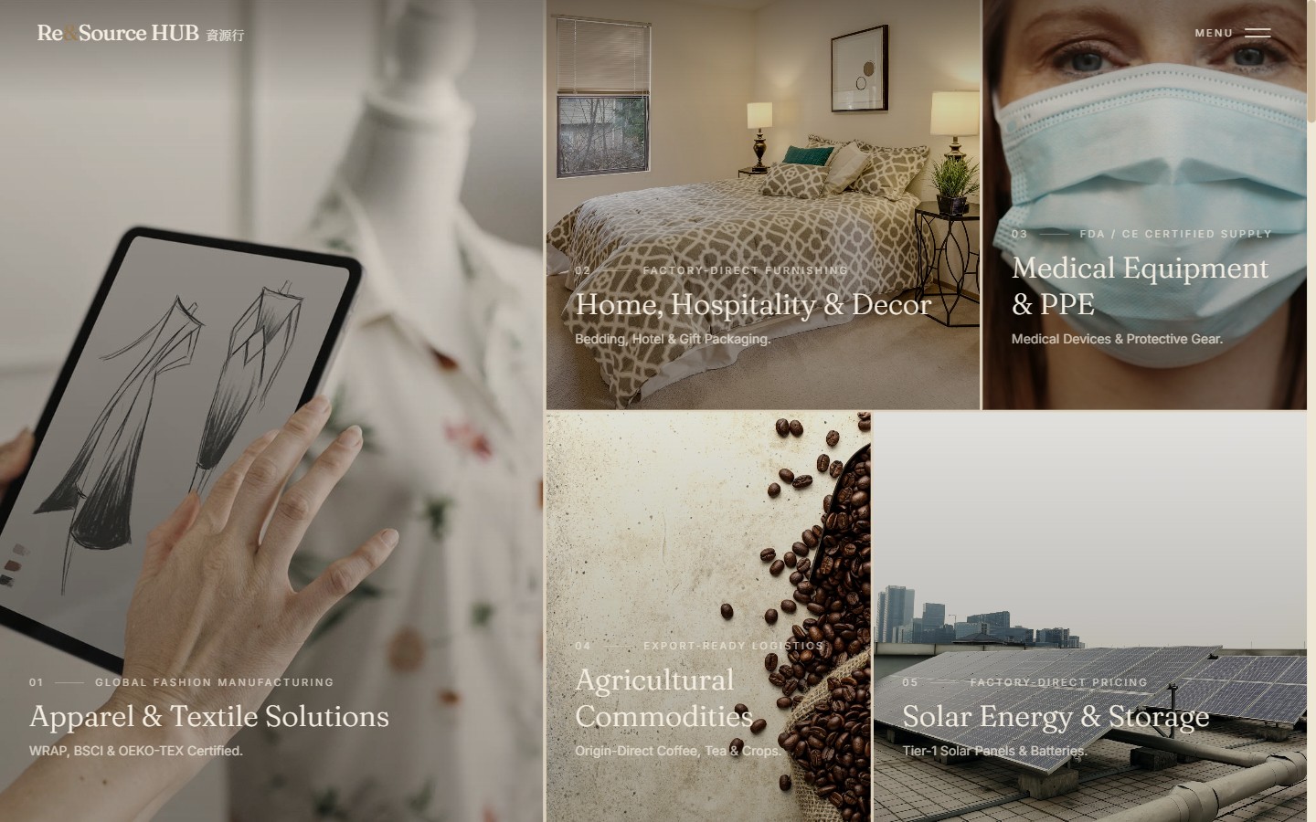
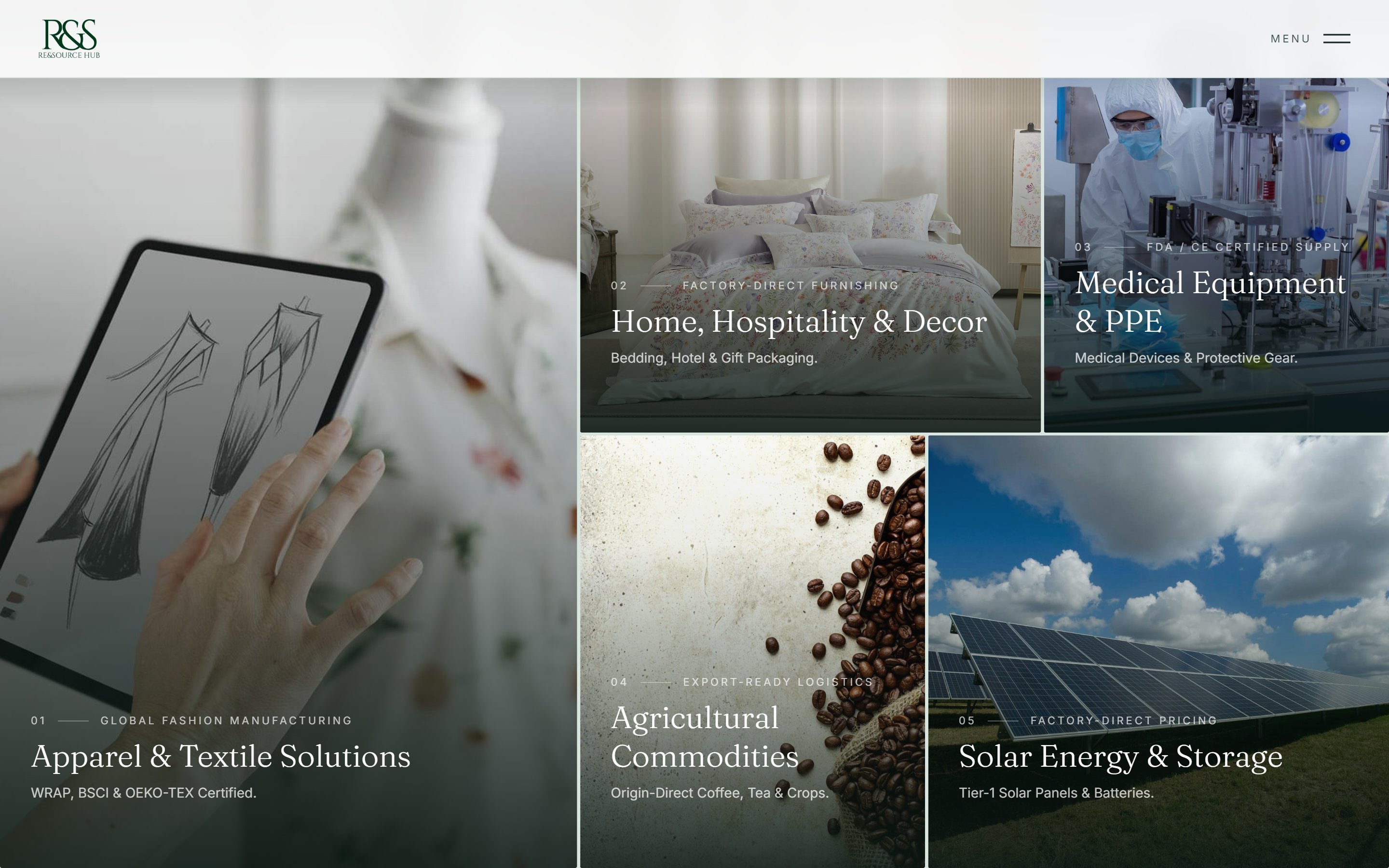
Re&Source HUB is a Hong Kong sourcing company with 25+ years in Far East trade. They connect global buyers to vetted manufacturers across China and Asia in five product categories — apparel & textiles, home & hospitality, medical equipment & PPE, agricultural commodities, and solar energy & storage.
Their existing website was a template: a single column of prose that said a great deal and showed almost nothing. I took the project from audit through to a live production site — restructuring the content, defining the art direction, designing the system, and building the whole thing in Next.js.
This case study documents the real path, including the parts that went sideways: a palette I argued the client out of following their own brief, and an image-sourcing problem that took six rejected candidates to solve for a single step.
Sourcing is a trust purchase. A buyer in Europe is about to wire a deposit to a factory they will never visit, in a country they have never been to. Everything on the website has to answer one silent question — can I hand this to you? The old site answered it with paragraphs. Three problems shaped everything that followed.
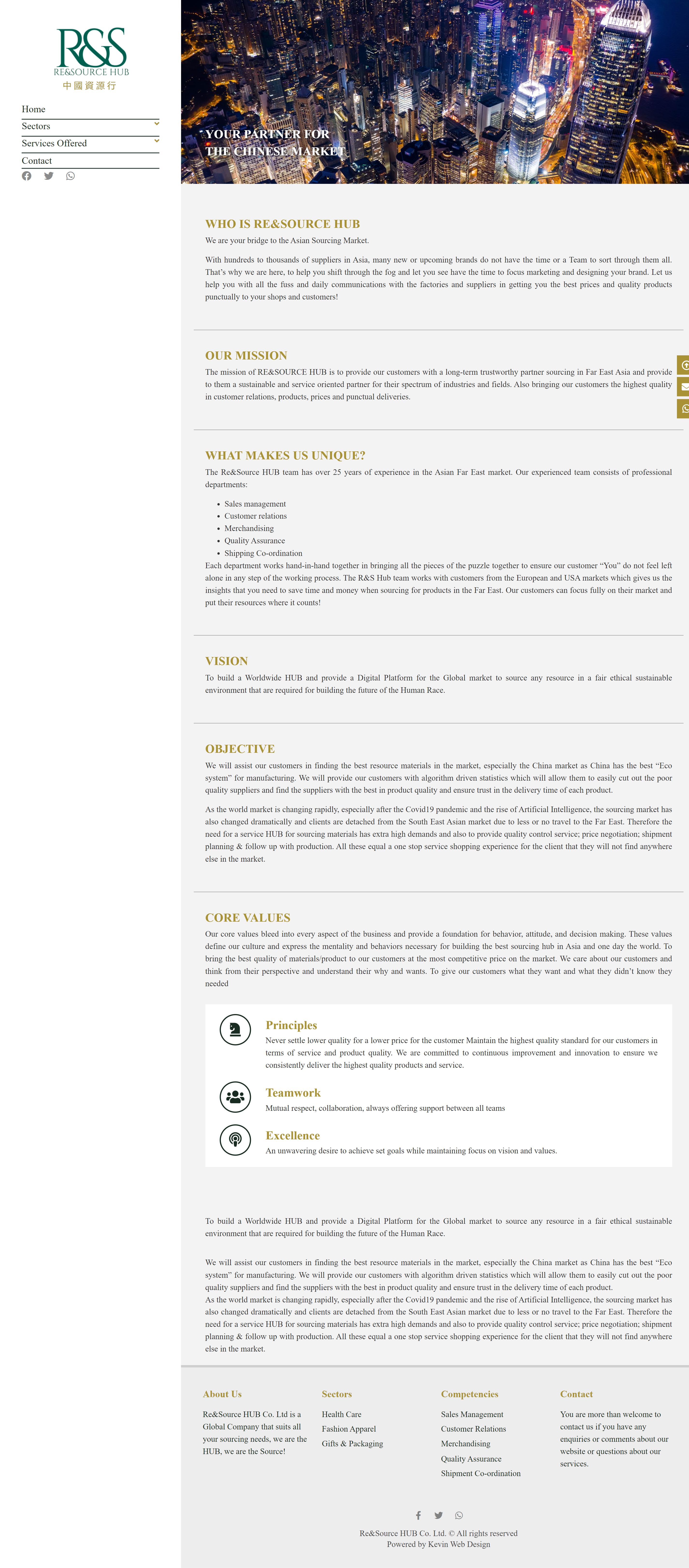
1 — No narrative, only blocks. The homepage stacked six near-identical text sections (Who We Are, Mission, What Makes Us Unique, Vision, Objective, Core Values) in the same typographic weight, with two of them repeated verbatim further down the page. There was no hero, no hierarchy, and no reason for the eye to travel.
2 — The commercial argument was invisible. Their strongest differentiator — that they consolidate multiple clients' orders to negotiate lower FOB prices for all of them — existed as one clause inside a paragraph. The single most persuasive fact about the business was doing no work.
3 — No proof of process. Nothing explained how an order actually moves from brief to delivery. For a service whose entire value is the process, that absence was the biggest hole on the site.
On top of that: two of the five categories — agricultural commodities and solar — were brand-new business lines with no existing photography whatsoever.
Everything between the brief and the live URL. There was no separate developer, no separate art director, no stock-photo budget — which shaped a lot of the decisions below.
Not a tidy retrospective diagram. This is the sequence as it ran, including the reversal in phase 06.
I started by transcribing every section of the existing site into a flat list and asking one question per item: is this a differentiator, or is this filler? That reframing did most of the work. "We are your bridge to the Asian sourcing market" is a differentiator. "To build a Worldwide HUB and provide a Digital Platform for the Global market" — which appeared twice on the same page — is filler.
Six homepage sections collapsed into four with a distinct job each. Two sections were cut outright. Roughly 1,400 words became roughly 400, and the words that survived were the ones a buyer would actually act on.
The client asked for "premium." Every competitor in sourcing and logistics looks the same — blue gradients, globe icons, container-ship stock photography — so copying the category would have guaranteed invisibility. Instead I benchmarked four editorial lifestyle brands the client responded to: Stellar Works, Audo Copenhagen, Gubi and Aesop.
What I took from them was structural, not stylistic: full-bleed imagery that carries meaning rather than filling space, serif display type against a clean sans for UI, asymmetric mosaic grids instead of equal card rows, and motion so restrained you notice its absence more than its presence.
One positioning decision came out of this phase and then governed every line of copy on the site. The old content leaned on "algorithm-driven statistics" and AI language. But the client's real advantage is 25 years of human relationships. So the site was written to say the opposite of what the industry says — landing on the pillar line "Handled by people, not algorithms."
The five sector pages are structurally identical and only differ in content — so building five pages would have been five places to forget a change. Instead there is one sector template driven by a single data file: copy, imagery, the ten process steps, and the downloadable guide all live as data per sector.
The practical payoff is maintenance. Adding a sixth category is one data object, not a new page. When the client later changed a process step's wording across the board, it was one edit in one file.
I skipped static high-fidelity frames and built the real thing early — Next.js, real type, real scroll, real motion, real breakpoints. For a site whose whole character lives in full-bleed imagery and scroll behaviour, a flat frame lies to you: it can't show you that a hero feels heavy at 1440px, or that a mosaic tile crops badly on a phone.
The trade-off is that early reviews look "finished" before they are, so I paired every review with annotated screenshots rather than a live link — which kept the conversation on the section under discussion instead of on the whole site at once. Over twenty review rounds ran this way.
The client's design director returned a ~4,000-word written review of the build. The verdict was that the foundation was right and three things were structurally missing. All three were fair, and none of them were visual — they were about what the page failed to do.
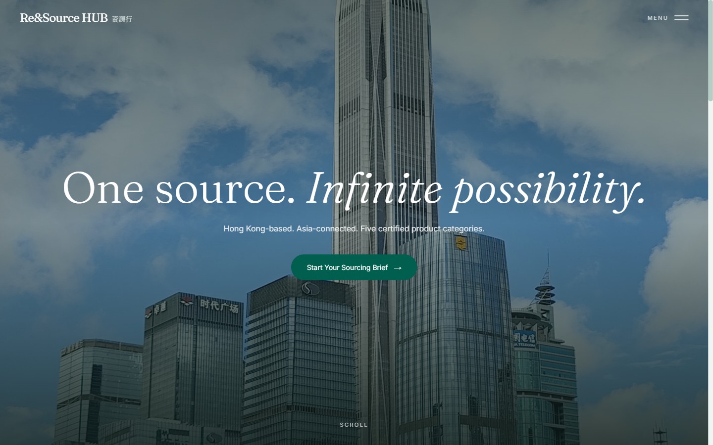
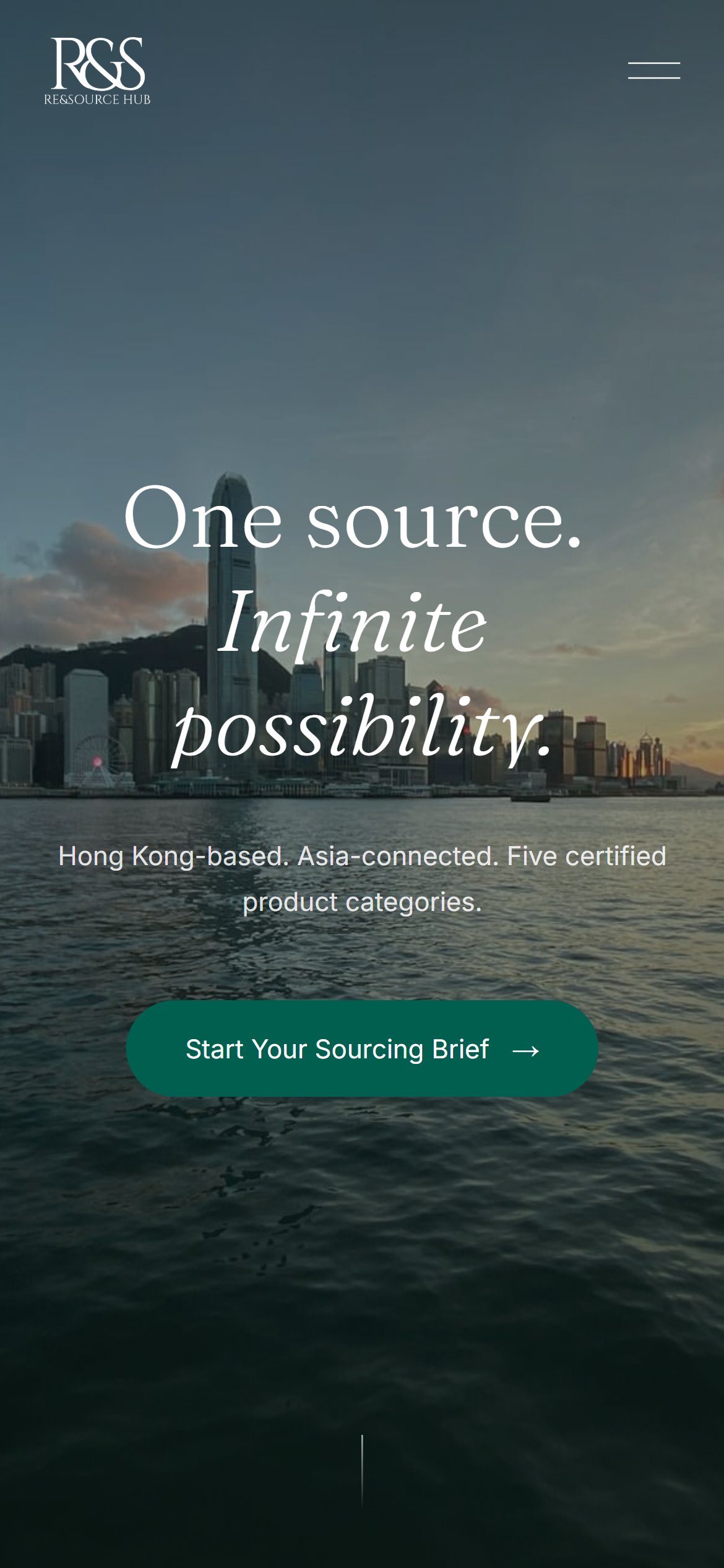
No homepage hero. The site opened straight into content. Added: a full-screen cinematic hero carrying the master slogan, "One source. Infinite possibility." — with one subline and exactly one call to action.
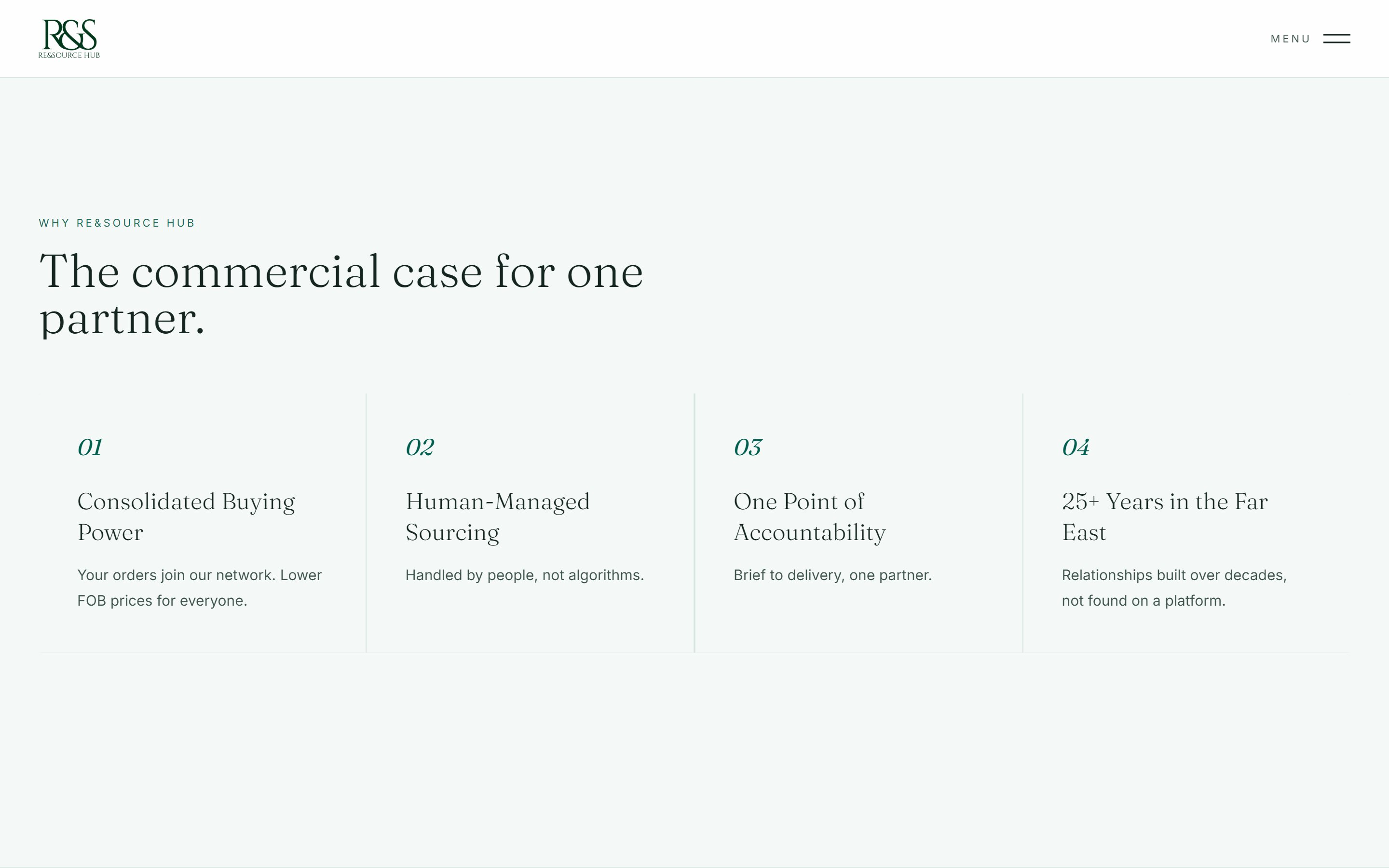
The commercial case was still buried. This was problem 2 from the audit, and my first pass hadn't solved it. Added: a dedicated section, "The commercial case for one partner", holding four horizontal pillars in plain language.
No process pages. Added a ten-step process to each of the five sector pages — which became the largest piece of work in the project (phase 07).
The written brief was explicit: keep the warm beige palette, it's working. I disagreed, and this is the decision I'm most glad I pushed on.
The beige direction was borrowed from the reference brands. But Re&Source HUB already owns a colour — their logo is pine green, #005F4E, and it appears on every document, business card and WeChat profile they have. The site was drifting toward a mood board and away from the brand the client had already spent years being recognised by.
I didn't argue it in writing. I rebuilt the homepage in the green direction and put the two side by side. The client confirmed the change the same day — and it later proved out, because when they swapped the hero photograph themselves post-launch, the green still held.
The pivot wasn't a find-and-replace. Dropping a saturated green onto warm beige reads as two brands colliding, so the entire neutral layer was re-derived with a green bias — near-whites, section tints, and hairlines all pulled slightly toward the brand hue so the palette reads as one family.
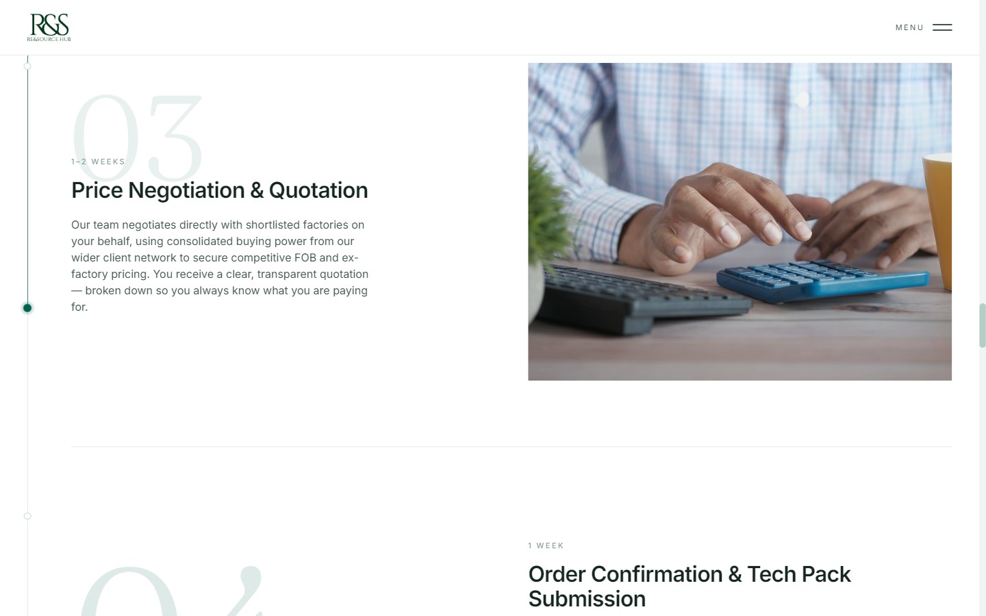
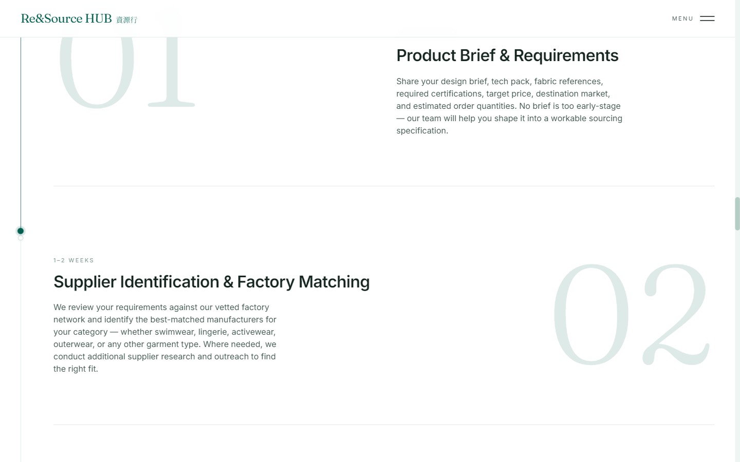
Five sectors × ten steps = fifty documented stages, each with a name, a realistic timeline, and two to three sentences. This was the answer to problem 3 — and the point where the site stopped describing a service and started demonstrating one.
The timelines matter more than the copy. "Bulk Production — 30–60 days" and "Final Quality Inspection — 1 week before shipment" tell a buyer that the company has run this enough times to know how long it takes. That is the whole trust argument, delivered as data.
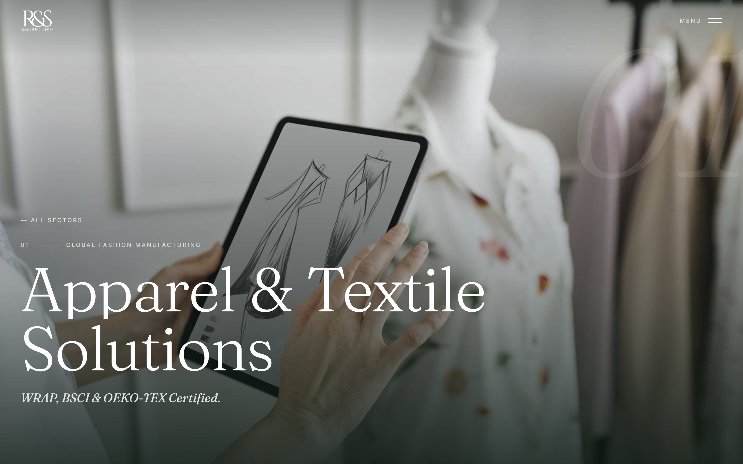
One component renders all fifty. An oversized ghost numeral behind the text, the timeline as a small caps label above the heading, editorial images alternating left and right, and a progress rail down the left edge that fills as you scroll — so a ten-step page always tells you where you are in it.
Deliberately, not every step gets an image. Three or four per page keeps a rhythm; ten makes a catalogue. The steps that earn a photograph are the ones with something to see.
102 images, no photo budget, and two business lines with no existing imagery at all. Every picture had to be sourced from free stock and still not look like free stock. So the first thing we agreed was a rule set, because "find a good photo" is not a brief.
Then a fourth rule appeared that the brief hadn't anticipated. The client rejected an image of a worker in a sari, and another of a Caucasian model in a surgical mask — not on any prejudice, but because the site promises vetted manufacturers in China and Asia, and imagery that contradicts that quietly undermines the claim. Right subject, wrong story.
So I adopted a working constraint: prefer face-free, hands-first crops. Hands on a calculator, hands inspecting a seam, hands over fabric. It sidesteps the casting problem entirely, and it happens to be the better photograph anyway — it reads as craft rather than as a person posing as a worker.
The scale of this loop is worth being honest about. One step — Price Negotiation & Quotation — went through six rejected candidates before it landed. The client's ideal frame was hands + a quotation + a calculator + fabric in one shot. That photograph does not exist in free stock. So I shipped the closest match and wrote the shortfall into a comment in the source, next to the image path, so whoever picks this up next knows it's a known compromise rather than a lucky guess.
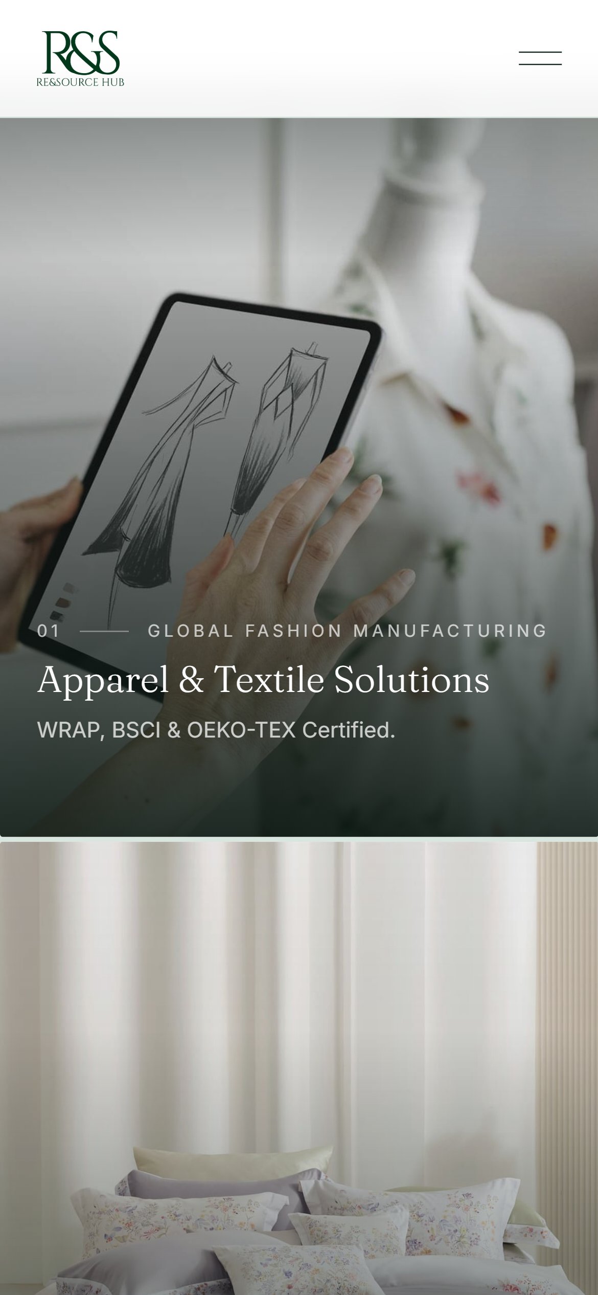
The mosaic collapses from an asymmetric grid to a full-bleed vertical stack — each category keeps a full screen of imagery rather than shrinking to a card. Process steps drop the left/right alternation. The desktop overlay menu, which previews a sector image on hover, becomes a plain full-screen list on touch, where hover doesn't exist.
Motion is intentionally boring: reveal-on-scroll, image parallax, a preloader, and a page-transition fade. Nothing loops, nothing bounces, nothing asks for attention. On a site selling reliability, restless motion is off-message.
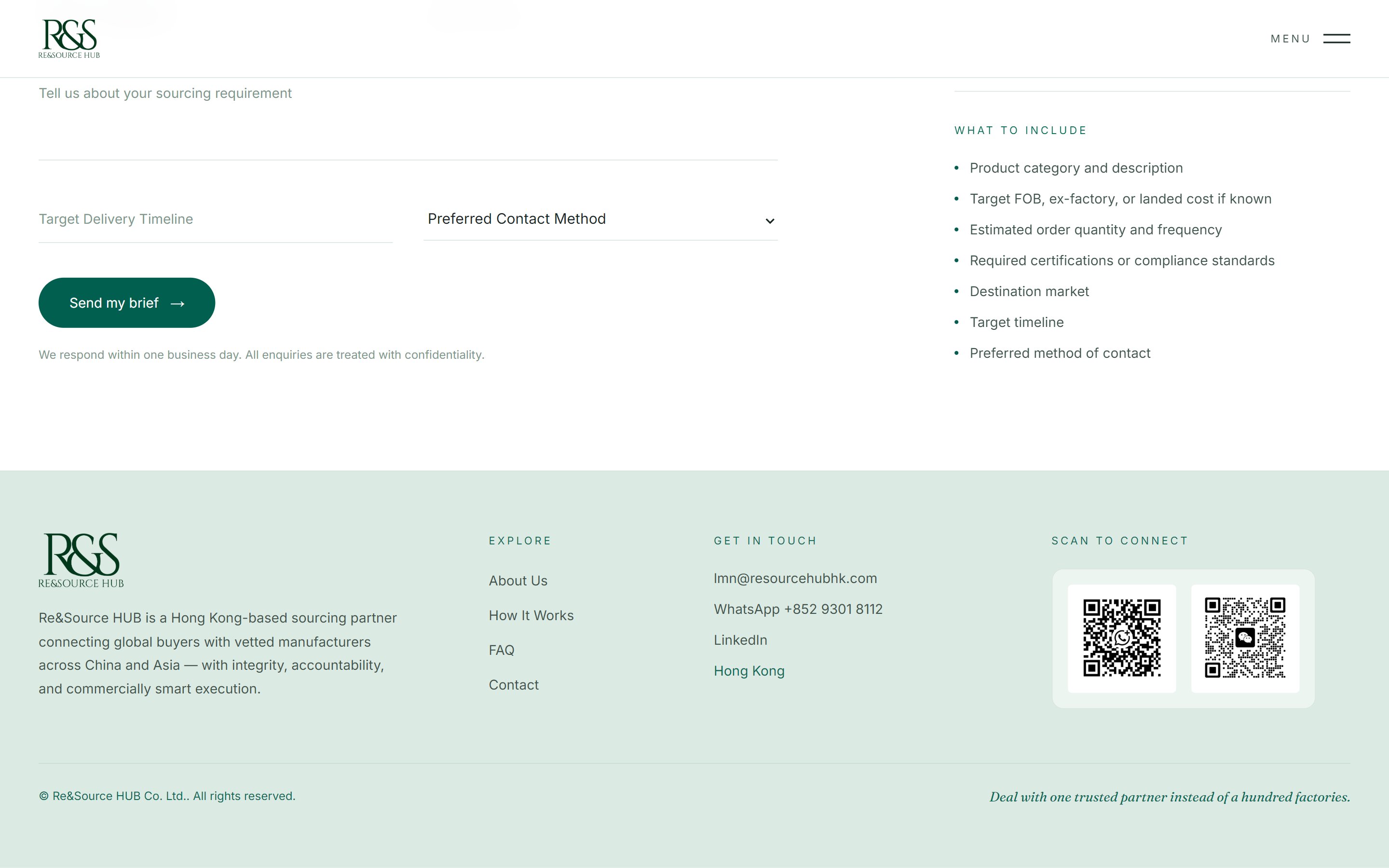
The last polish pass came from the client's own market knowledge rather than from design: a footer QR column for WhatsApp and WeChat. Their buyers and factory contacts in Hong Kong and mainland China scan; they don't click. The text wordmark was also replaced with the real logo artwork, cross-fading between its dark and white versions depending on what the nav is sitting over.
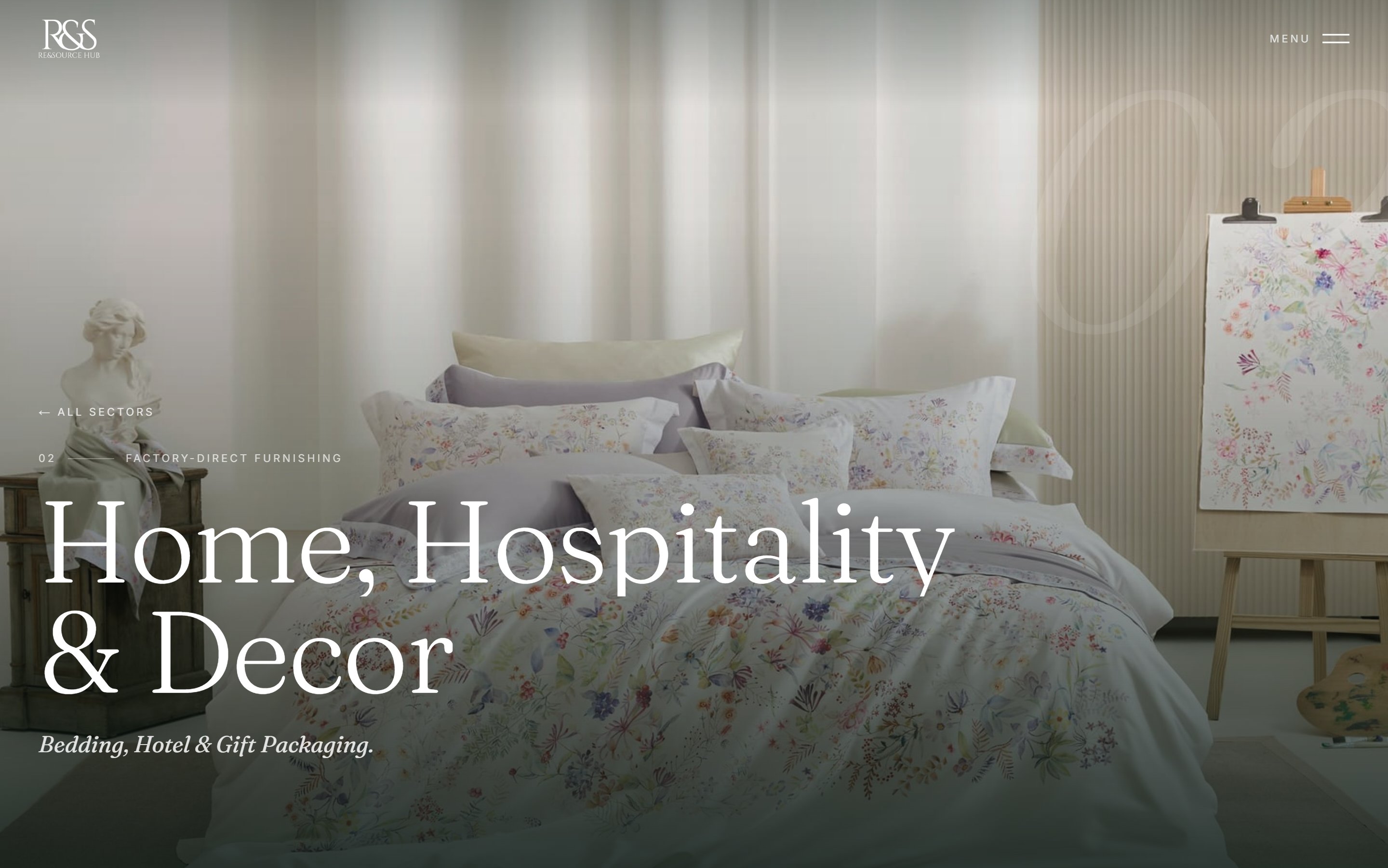
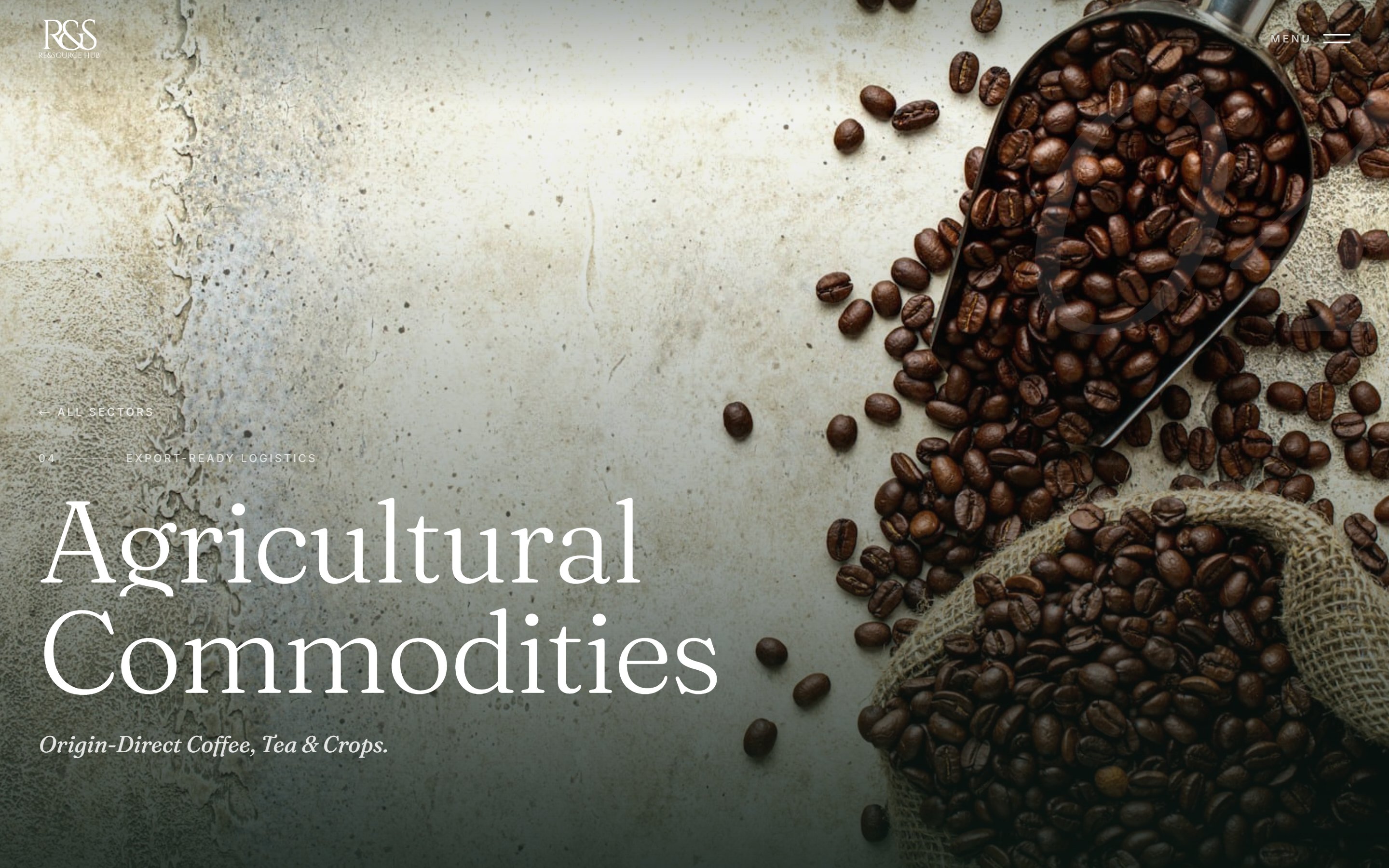
Shipped and in production on the client's own domain. Best experienced on desktop, where the overlay menu previews each sector on hover — but it was built mobile-first.
Visit resourcehubglobal.comThe site went live on the client's own domain and they now run it themselves — they have already swapped the homepage hero photograph without needing me, which is the outcome I actually wanted. A site the client can't maintain is a site that decays.
A company that had been selling twenty-five years of process with six paragraphs of prose now shows fifty documented steps with real timelines, five downloadable sourcing guides, and a commercial argument stated in four sentences on the homepage instead of hidden in a subordinate clause.
pages, from six route files
documented process steps across five sectors
images art-directed, sourced and graded
review rounds with the client
Build in the real medium, early. Reviewing a scroll-driven site in flat frames hides the problems that matter. The cost is that unfinished work looks finished — solvable by reviewing in annotated screenshots rather than a live link.
Show, don't argue. The palette reversal contradicted a written brief from a design director. It took one afternoon of building the alternative, and zero of debate. If I'd sent an email instead, I think the beige would have shipped.
Constraints beat taste when sourcing images. "Find a good photo" produced six rejections. "Face-free, hands-first, real environment, natural light" produced usable results fast — and the rule was a better art director than my own eye.
Write down the compromises. Some images are the best available, not the best imaginable. Recording why, next to the file path, turns a silent shortfall into a task someone can finish later.