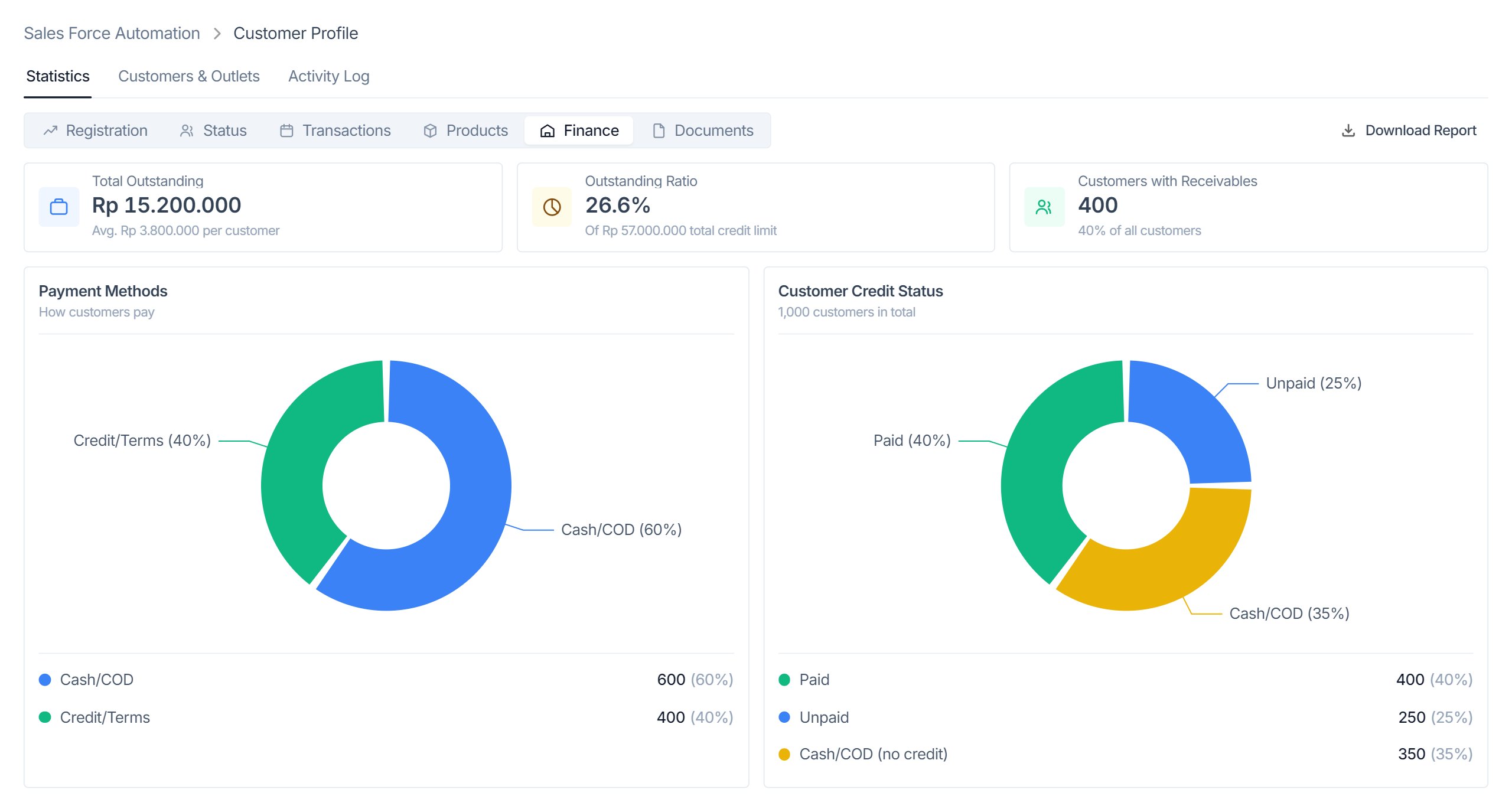
Customer Profile is where a distributor's back office keeps track of every shop it sells to: who owns it, where it is, when it's open, how it pays, and whether its paperwork is complete. One customer can own several outlets, and each outlet has its own address, schedule, documents and status.
The module was already live and in daily use. My job was to rebuild it on the company's design system and fix how it worked, without adding or removing a single feature. The live module was the spec.
I went through the live module screen by screen before drawing anything. Three problems kept showing up.
1 — Everything opened on top of everything else. Viewing a customer, adding a customer and adding an outlet each opened a full-screen overlay. The sidebar, breadcrumb and tabs disappeared, so people lost track of where they were. The customer detail screen was even titled "Edit Customer".
2 — Long forms that felt harder than they were. The outlet form is split into three long sections. Opening hours and delivery hours were two side-by-side panels that listed the same seven days twice. Province, city, district and postal code showed up as disabled inputs, even though the system fills them in from the map pin. And the four-step stepper for new customers couldn't be clicked.
3 — Text that was hard to read. Status labels used the bright accent colors as text color, and secondary text used the lightest gray. Against white those measured between 2.3:1 and 3.7:1, below the WCAG AA minimum of 4.5:1 at the 11–13px sizes this module uses.
I worked on it end to end: auditing the live module, writing the fidelity checklist, redesigning every screen, and building the clickable prototype that engineering builds from.
Deliverables: an audit and spec analysis, a checklist of every route, tab, dialog and validation message, and a single-file interactive prototype that uses only the existing design system tokens.
There was no product spec, so the live module became one. I walked every route and wrote down each surface: six statistics tabs, two list views, the customer detail, a four-step add-customer flow, a three-section outlet form, six confirmation dialogs and every error message. That list decided what the redesign had to cover, one to one.
I also found four bugs in the live app. The Close Outlet dialog, for example, left the customer's name blank and read "…outlet from customer ?". I sent them to the team as a list rather than quietly changing behaviour in the redesign.
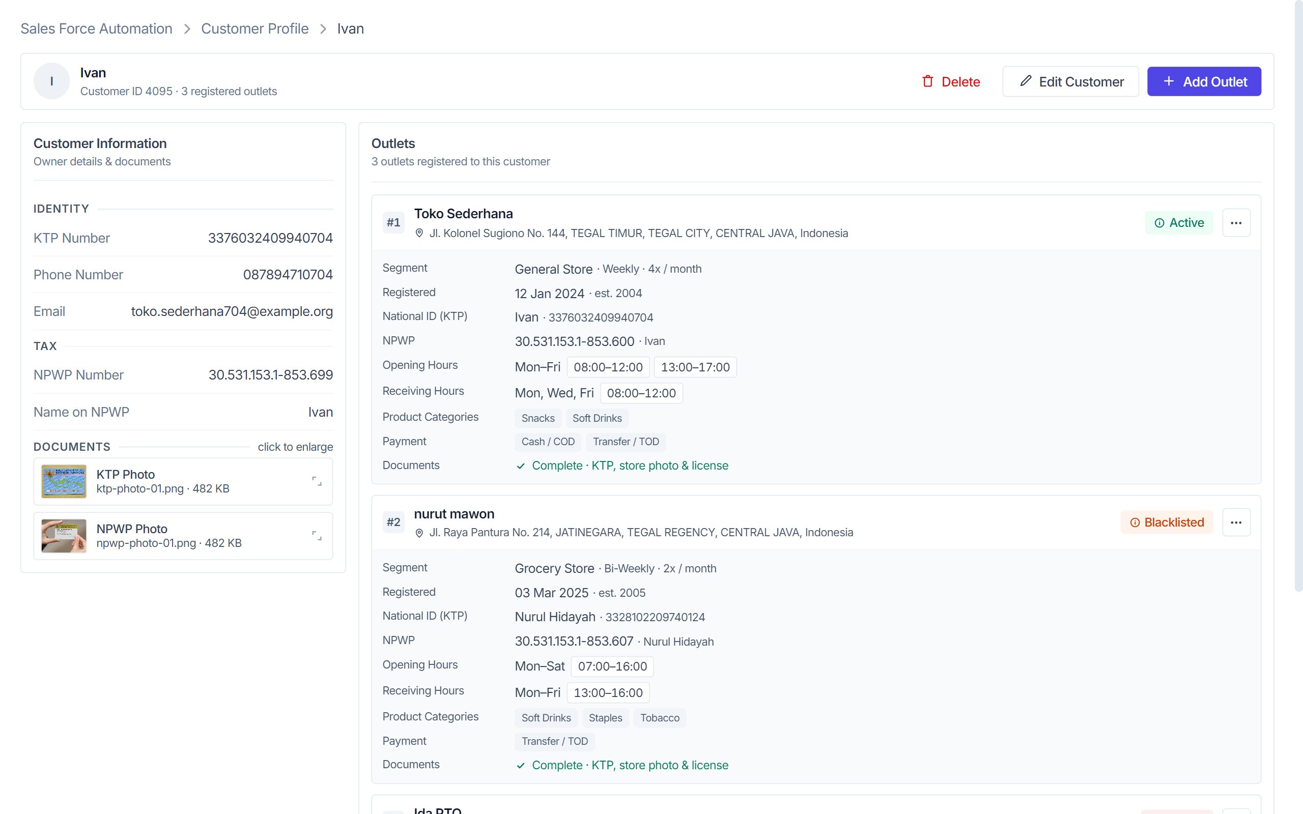
Customer detail, Add Customer and Add Outlet became regular pages inside the module. The app shell stays put, and the breadcrumb tells you where you are. Actions that apply to the whole customer (Delete, Edit Customer, Add Outlet) sit together in one header. Each outlet is a card with the things sales teams ask about most: segment and visit frequency, opening and receiving hours, payment terms, and which documents are still missing.
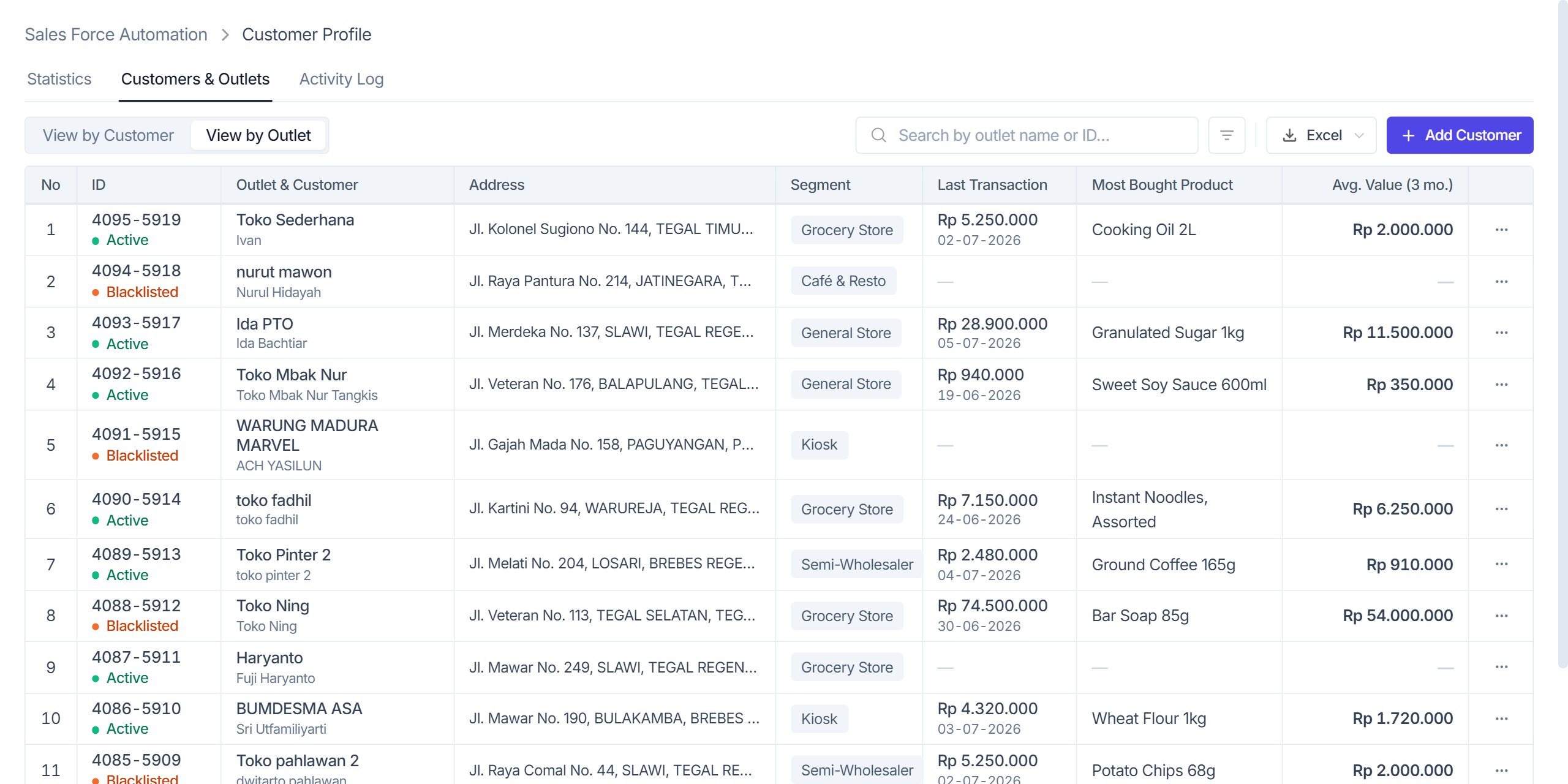
The list has two views because people search in two ways: by owner name or phone, or by shop name and address. Each status is a colored dot next to dark text, so the color still helps but the label passes contrast. Hover a status to see what it means: Active is an order in the last 30 days, At Risk is 31–90 days, Dormant is more than 90. Missing values show a dash instead of a misleading "Rp 0".
The whole row is clickable and counts as one keyboard stop. Pagination gave way to lazy loading under a sticky table header, so the column names stay visible while you scroll.
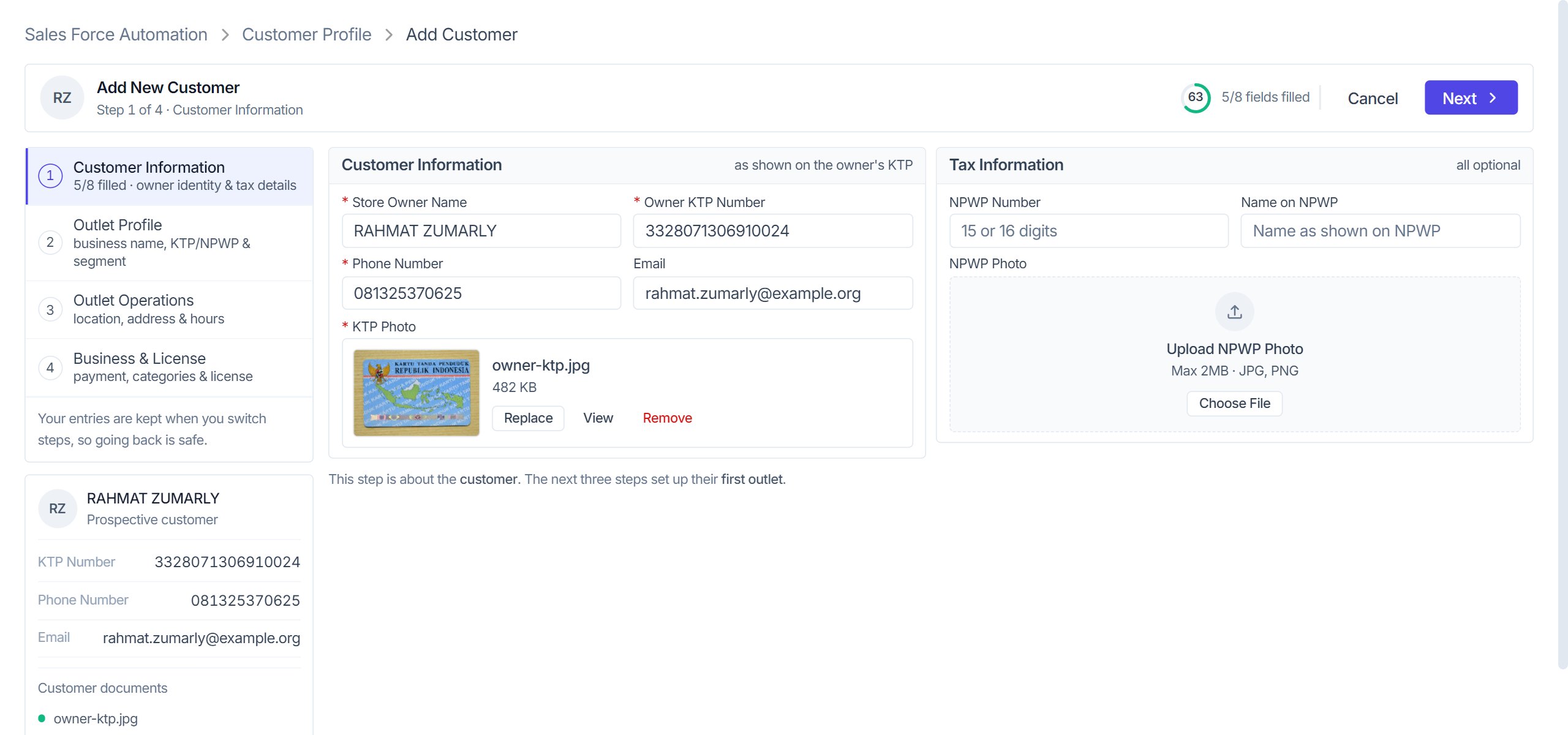
The old stepper couldn't be clicked and gave no sense of how much was left. I replaced it with a side rail that lists all four steps, shows how many fields are filled in each, and lets you jump between them. Nothing is lost when you go back. Under the rail, a summary card fills in as you type, so you can double-check the ID number before saving. Cancel, Back and Next live in a sticky header instead of at the bottom of a long form.
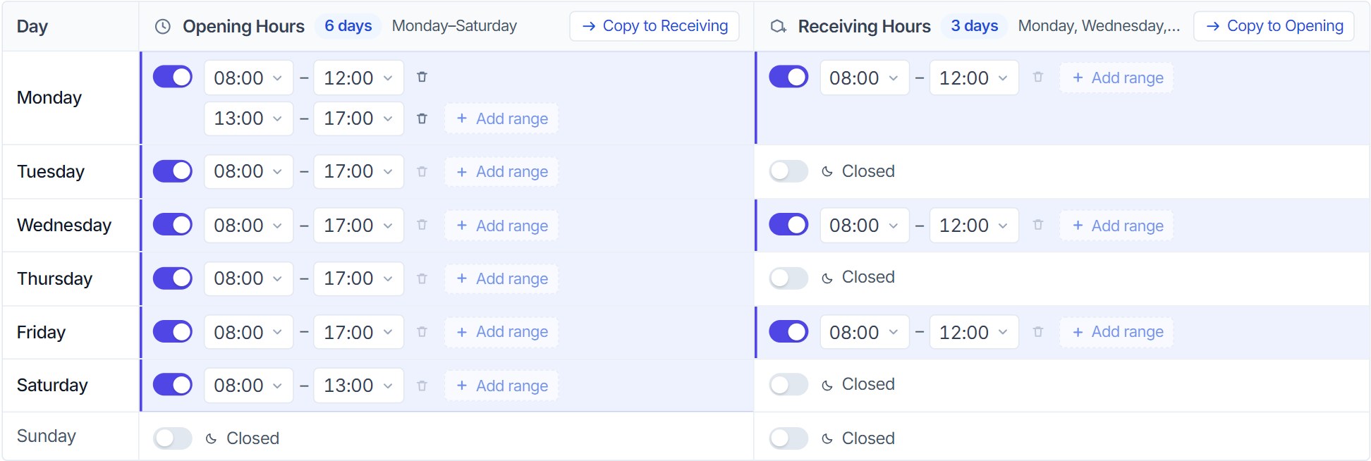
Opening hours and receiving hours now share one table: a row per day, a column per schedule. That's seven rows instead of fourteen, and you can see when a shop opens and when it accepts deliveries on the same line. Times are picked from a list rather than typed, so a value like 25:70 can't happen. A day can have more than one range for shops that close at midday, and you can copy a day to the whole week or copy one schedule into the other.
On the same step, the region fields the map fills in are shown as a single read-only line. A row of disabled inputs looked like something you were supposed to fill in.
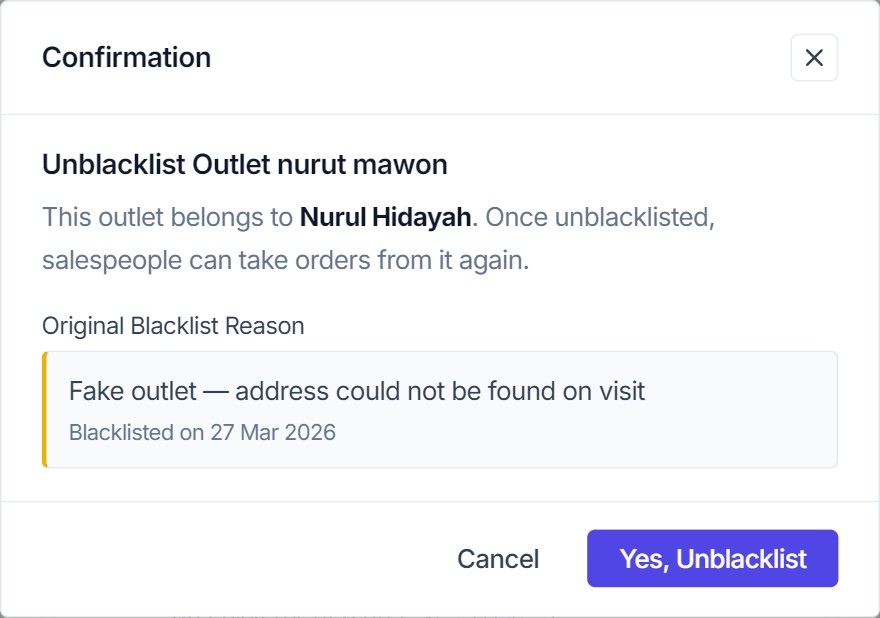
Every blacklist, close and delete dialog says in plain words what will happen and who it affects. Unblacklisting an outlet shows the original reason and date as a read-only quote, because that's what an admin needs before reversing someone else's decision. Restoring an outlet isn't destructive, so that button uses the primary color instead of red.
Admins live in this module all day, so the forms are compact: 11px labels, 28px inputs, a 12-column grid. My first pass went too far, with 10px labels and pale gray hints that failed contrast. In the final version inputs stay at 13px and all secondary text is at least #64748b (4.8:1). The density comes from tighter spacing, not smaller type.
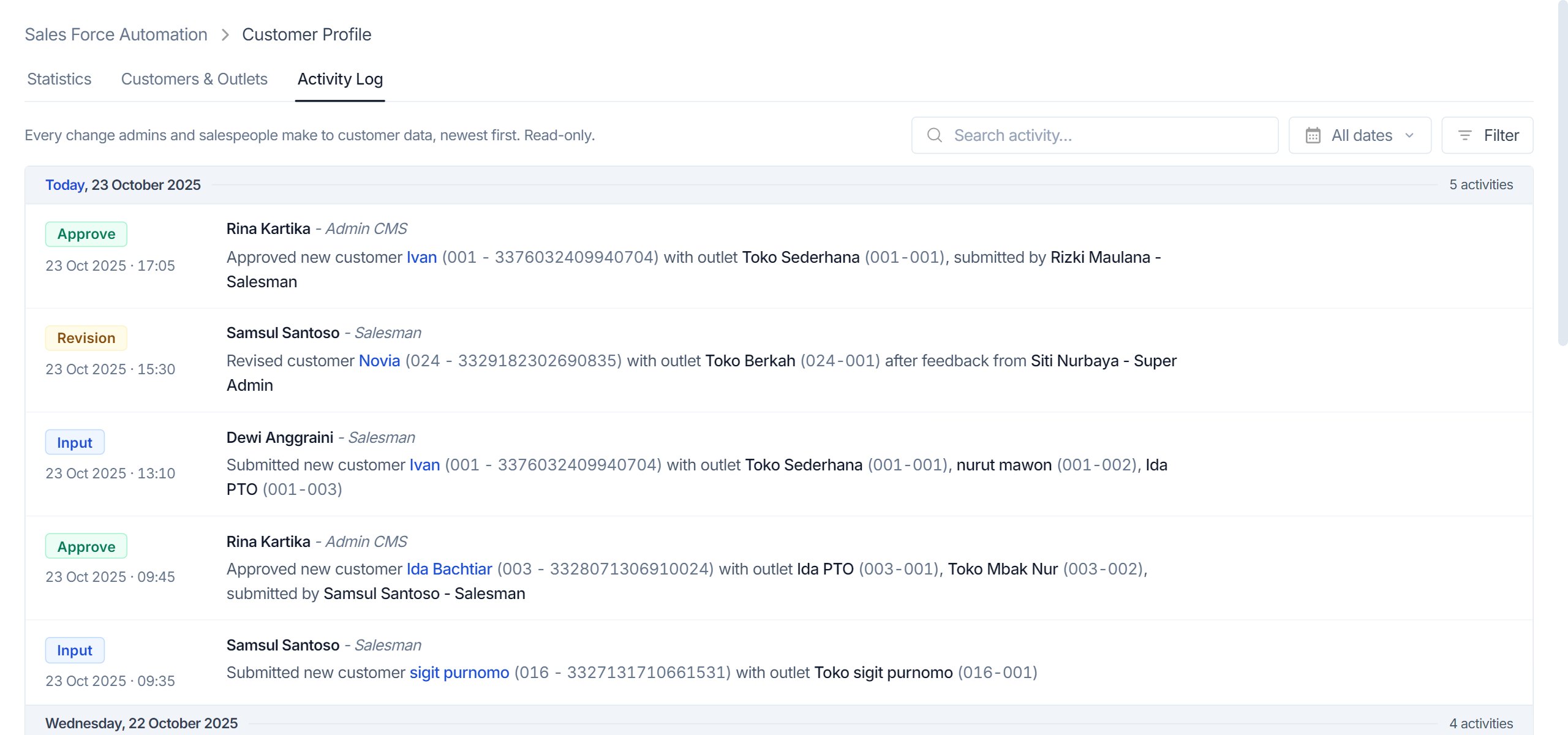
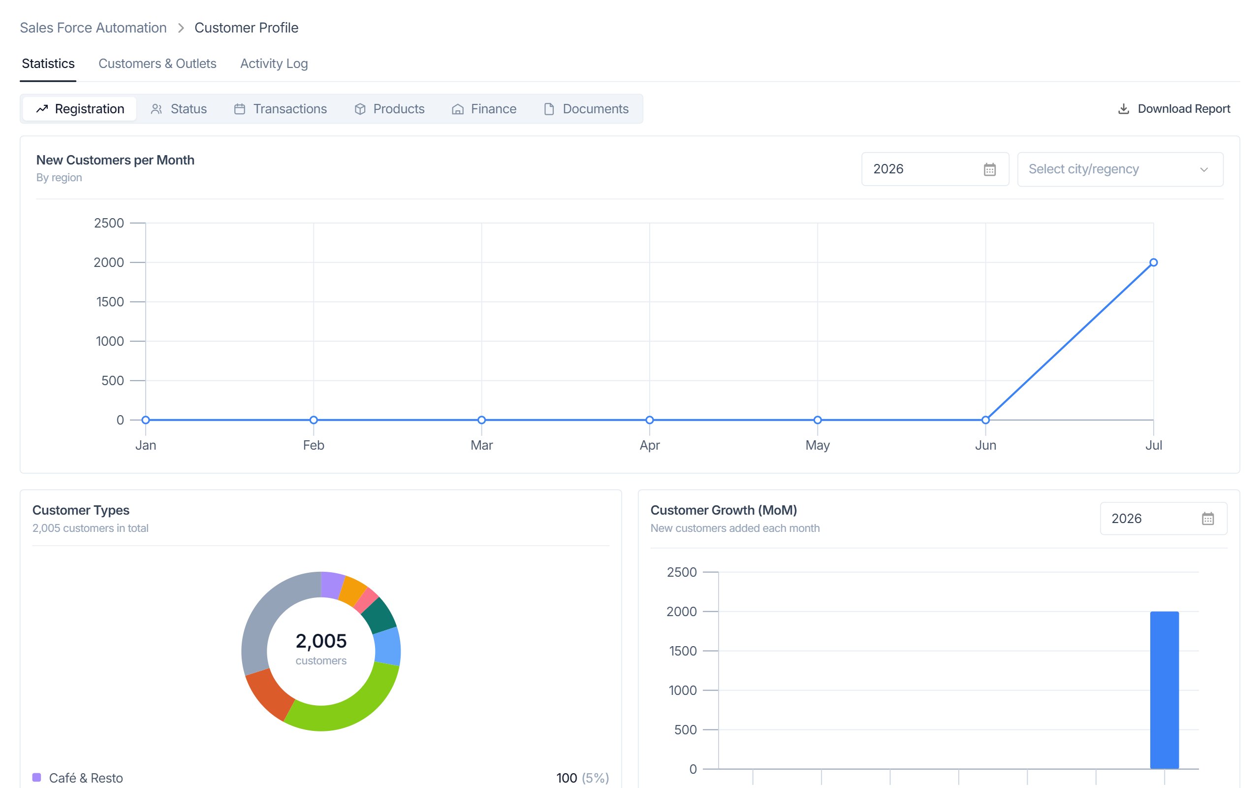
The activity log records every change with who made it, their role, and the customer and outlets involved. Entries are grouped by day and can be filtered by date range, activity type and role. The statistics tab keeps all six of its reports — registration, status, transactions, products, finance and documents — with charts that show exact values on hover.
Everything in it is clickable: both list views and their filters, the customer detail, adding a customer or an outlet, the hours editor, every confirmation dialog and the activity log. Best viewed on a desktop screen.
Launch PrototypeThe prototype went to engineering as one self-contained file, together with the fidelity checklist. Because every feature maps one to one to the live module, the team could treat it as a UI replacement instead of a new feature that needed scoping.
Looking back, the audit did the most work. Listing every surface before designing meant nothing got dropped by accident, and the live bugs reached the team as a short list instead of surprises during build.